React and CSS Layout of A Static Blog Page
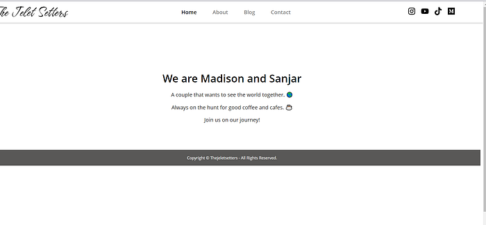
I am creating my second static blog website—a travel website for my girlfriend and me. I offered to build the website since I had some experience creating my own portfolio website.
The Layout
A general simple layout of a static blog website is a navigation bar at the top, the main content section below that, and a footer at the very bottom of the page.

The navigation bar is always at the top, and it could be sticky (always appear at the top) on scroll.
The main content section is responsible for displaying the different pages of the website. And the pages should share a consistent layout.
The footer sticks to the bottom of the page, even if the main content is not spanning the entire height of the page. Sometimes the footer is not visible if the page content extends beyond the height of the screen and the user has to scroll.
That is the simple layout I wanted to achieve for this website. I used CSS in JS with styled-components and React within the Next.js framework. This is my first time working with Next.js as I wanted to learn a new framework or tool.
The React and CSS
To start, I made sure the HTML element had zero margins or padding in the global styles file.
The layout component takes care of the spacing and positioning. This component is shared across all pages in the app.
The layout component
The Container is a styled component, and it contains the navigation bar, main page content and the footer.
The padding at the top of the container is space reserved for the navigation bar, which is positioned absolutely in the HTML document.
The container also ensures the pages will always have a minimum height equal to 100% of the viewport height. The viewport is everything that is visible on the screen.
Each page takes on the layout and passes its unique content as react children to the layout component. The layout doesn’t know ahead of time which page will be rendered, and it doesn’t matter thanks to React Composition. Check out React Composition vs Inheritance.
Navigation Bar
NavContainer is a styled component that is the container for all other elements inside the navigation bar. We are not worried about what goes inside the navigation bar, as it can be customized.
The container is positioned absolutely and takes on the same height that was reserved for it by the layout container. The container has no margins with respect to the layout container and the viewport borders ( top& left are 0).
The navigation bar spans the entire width of the layout or screen.
Elements in the container are laid out centrally both vertically and horizontally according to the CSS Flexible Box Layout.
I haven’t decided whether I want to make the Navbar stick at the top of the page and be visible when the user scrolls. I might write a separate article about it.
Pages Layout
For now, each page consists of a section component and another section component within which all the content lives.
The Section container component spans the entire width of the layout. Padding up top creates some spacing between the navigation bar and content, and padding at the bottom does the same with the footer.
The height of the container is calculated such that the footer is always pushed to the bottom of the page, even when there is not much content.
The min-height property is crucial since without it if the content takes on only a small part of the screen height, the footer would float to the middle of the screen. As a result, there would be empty space below the footer, which is not a desirable UI for a website.
Notice that the min-height takes into consideration the height of the navigation bar and the footer.
Lastly, SectionCenter centers the content using margin: 0 auto and restricts that the width the content can take on.
This is a simple skeleton layout for all pages. In the future, I might have pages with different layouts. A gallery page could potentially require more width to display media, in comparison to a blog page.
Footer
Probably the simplest component in the layout. The Footer takes on a certain height and has a simple text at the center for now.
It spans the entire width of the page, has content centred via FlexBox, and has some padding.
Since the layout logic was mostly determined in the parent layout component, the navigation bar and the pagelayout , the footer just follows the HTML document flow and is rendered at the bottom of the page after the page content.
That’s it! I hope that was a simple breakdown of a simple static blog website layout. Please let me know if there are things I can improve on and I hope you enjoyed reading this!
